
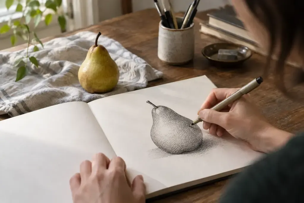
A pen cannot make a pale grey stroke simply by becoming a little less black. In cross-hatching, the apparent grey comes from the relationship between dark lines and the light paper left between them. That makes spacing a useful drawing tool.
Make a value strip before drawing the object
Draw five small boxes. Leave the first empty. Give the second one set of comfortably spaced parallel lines. In the next boxes, add another direction and gradually reduce the open gaps. Keep the same pen so you can see what the arrangement of lines contributes.
Do not aim for a perfect printed gradient. Notice when a new layer makes the patch meaningfully darker and when it only makes it look busier. A few large gaps can keep a supposedly dark patch surprisingly bright.
Let the strokes describe the form
Place a pear or a folded cloth under one steady light. Sketch the main outline lightly, identify the lightest area, and leave that part mostly untouched. Start in a middle shadow rather than attacking the darkest spot first.
Try gently curved strokes around the pear’s rounded side. Cross them with a second family of lines where the shadow deepens. The direction need not copy an imaginary grid; it can help suggest a surface turning away from the light.
Keep the cast shadow and the object’s own shadow distinct. They may both be dark, but their edges and shapes tell different parts of the scene. Squint at the drawing from a short distance to see whether the large light-and-dark arrangement reads before examining individual marks.
Stop before every gap disappears
If the pen ink needs drying time, let one layer settle before adding another. Repeated scrubbing can damage paper and flatten the lively texture you were building. Save a small unfinished patch for comparison: it may show that the extra layer was unnecessary.
Date the value strip and keep it with the sketch. It becomes a useful record of what that particular pen and paper can do, rather than a rule that every drawing must follow.