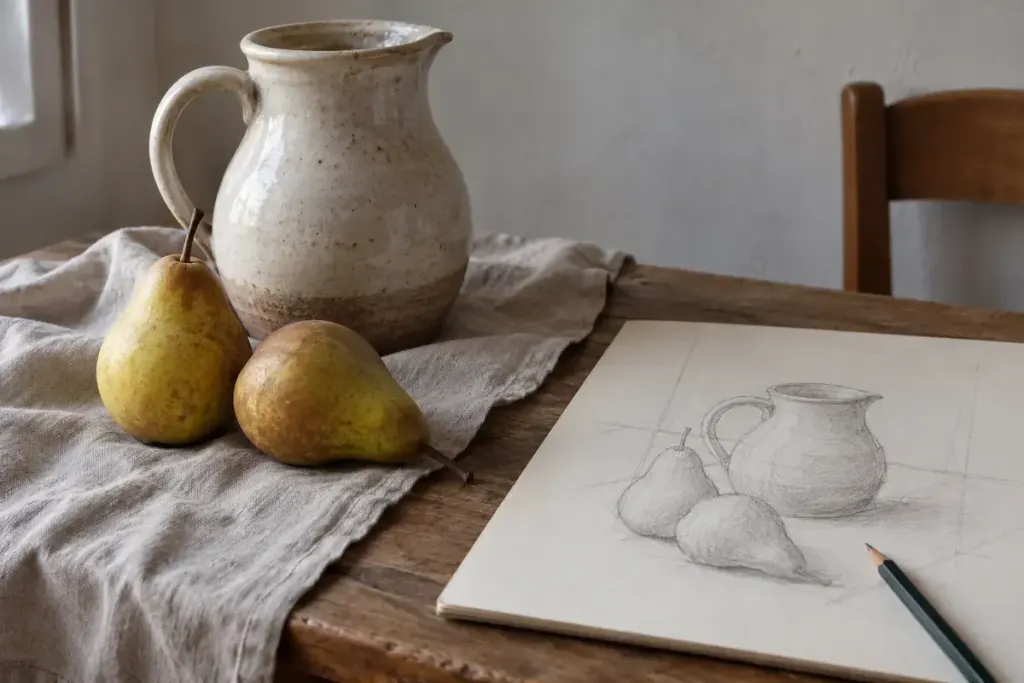
A jug can become harder to draw the longer you think about what a jug should look like. You may keep correcting the handle while overlooking the narrow opening inside it. For a short drawing exercise, make the empty shapes your subject instead.
Set two or three ordinary objects on a table and choose a position you can keep. A jug beside a pear gives you several useful gaps: inside the handle, between the objects, and between their outer edges and the boundary of your page.
Give the empty space an outline
Draw a small rectangle to represent your composition. Inside it, sketch one gap as if it were a flat piece of paper you could cut out. Follow its widest part, its narrowest point and the direction of each edge. For the moment, avoid naming the objects around it.
Compare the gap with its neighbours. Is the space above the pear wider than the opening beside the jug? Does the handle opening sit higher than you first drew it? These are observations to test from your chosen viewpoint, not rules about how a still life must look.
Make one comparison at a time
If something feels wrong, change a single boundary and look again. Moving every outline at once makes it difficult to tell which adjustment helped. Keep the marks light enough to leave an earlier attempt visible.
Try a second thumbnail after moving one object slightly. The objects are unchanged, but the empty shapes now form a different arrangement. Put the sketches side by side and choose the version whose spacing interests you.
This is an observation exercise, not a requirement to remove all detail from finished work. Once the arrangement feels convincing, return to the objects themselves: their surfaces, shadows and individual character.
Keep the first sketch even if it looks awkward. It shows what you assumed before you started comparing the spaces, which can be a useful reference for the next session.