
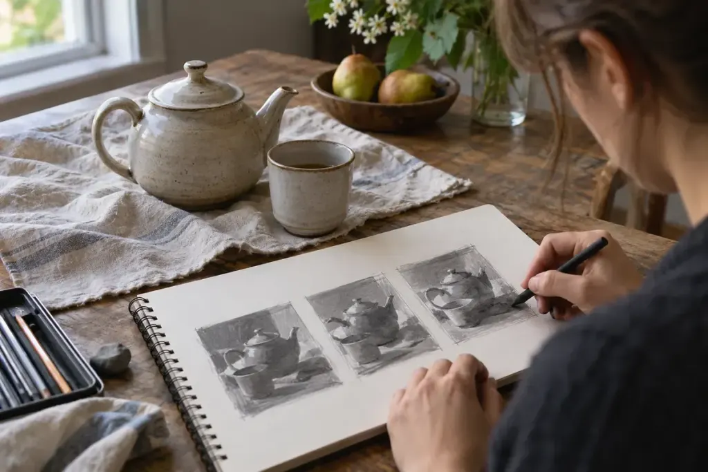
A painting can contain appealing colours and still feel difficult to read. One way to investigate is to remove most of the decisions: make a tiny sketch using only a light, a middle value and a dark.
Value describes relative lightness and darkness. Dan Scott’s discussion of notan and value studies shows how simplified light-and-dark groupings can reveal an image’s underlying arrangement. A three-value sketch is an exercise in choosing those groups, not a miniature finished painting.
Give the experiment a small subject
Set a cup beside a folded cloth under one light source. Draw a rectangle roughly the size of a postcard, then place the largest shapes inside it. Leave the lightest group as the paper, use one consistent grey for the middle group and reserve the darkest mark for the dark group.
Do not add a fourth shade every time something feels uncertain. Instead ask which of the three groups the shape needs to join. The restriction is what makes the decision visible.
Make a second version, not a correction
In an illustrative pair of thumbnails, the first might place a dark cup against a dark background. In the second, you could move the cup so its edge meets the lighter cloth. Compare how easily the cup separates from its surroundings. You have tested placement before committing to an elaborate painted surface.
Write one sentence under each version: “The handle disappears here,” or “The cloth takes attention away from the cup.” Specific observations make it easier to choose what to try next. “Good” and “bad” are much less useful studio notes.
A phone’s monochrome preview can offer another view, but it is not an unquestionable judge of the picture. Lighting, exposure and colour conversion affect the result. Return to what you can actually see in the subject.
Keep the study quick enough that discarding one version feels easy. Its job is to expose a useful compositional choice, leaving colour, texture and finer edges for the work that follows.