
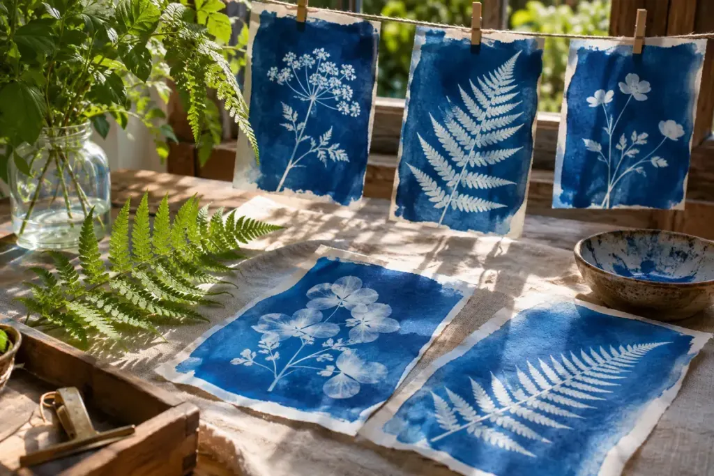
A fern laid on blue-sensitive paper can become an image without a camera. In a cyanotype contact print, the arrangement is the exposure: objects block some of the light reaching the prepared surface, leaving pale shapes against the blue that develops through processing.
The V&A’s photographic-process guide explains the iron-salt chemistry behind cyanotype and its nineteenth-century origins. For a first project, commercially prepared paper offers a manageable introduction. Follow that product’s exposure, washing and handling instructions rather than assuming every paper needs the same number of minutes.
Compose on ordinary paper first
Choose a few objects with distinct silhouettes. A leaf with fine edges, a piece of open lace and a solid paper shape will interrupt light differently. Arrange them on a sheet of ordinary paper before taking out the light-sensitive material. This gives you time to change the spacing without accidentally beginning the exposure.
Ask what you want the print to show. An isolated leaf emphasises its outline; overlapping leaves create a denser mass. A recognisable object can become an interesting abstract form when only part of it appears at the edge.
Keep the first experiment small
Make a simple record: paper brand, approximate exposure conditions, objects used and the processing steps followed. “Bright overcast afternoon” is more informative than “outside”. If an edge is soft, note whether the object sat flat or lifted away from the surface. That observation helps you form a question for the next print instead of treating every unexpected result as failure.
A useful personal exercise is to repeat one arrangement while changing only one factor. Keep the earlier print beside the new one and compare the spaces around the objects as well as the blue. This is a creative test, not a calibrated measure of sunlight.
Let finished work dry as directed before deciding how to display it. The museum’s examples of early cyanotypes also offer a reminder that careful placement can be expressive: the modest gap between two stems may matter as much as the specimen itself.